How I designed 48 screens in isolation, watched 35% of them change during implementation, and learned the lesson that reshaped how I work with development teams forever.
Context
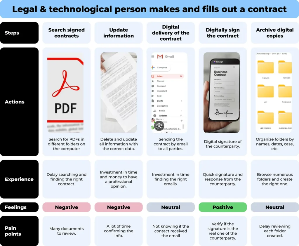
The reality was anything but straightforward. Legal contracts in Colombia carry a specific weight. Every clause, every variable, every decimal in a financial calculation can become a liability. The teams using these contracts weren’t just slow. They were making mistakes. An average of 7 typing errors per contract in critical financial clauses. Each contract took about 20 minutes to complete manually. Verification of signed documents required in-person checks or unreliable email chains.
I joined as the sole product designer. No design team. No existing product. Just a CEO with a vision, a problem worth solving, and the expectation that everything could be built at once.
The Real Problem
The problem wasn’t just the manual workflow. It was scope.
From day one, the CEO wanted everything: templates, custom contract creation, variable logic, multi-device support, web and mobile, brand identity, the landing page. All of it. Now. This is the classic scope creep scenario, but in this case it came from the top. The person defining the product wanted it all before we had built anything.
I spent the first month in conversations with the CEO, mapping the problem space, defining the value proposition, and fighting the instinct to open Figma before understanding what we were actually building. The goal was to get to a real MVP definition, which meant cutting things the CEO didn’t want to cut.
My Role and Entry Point
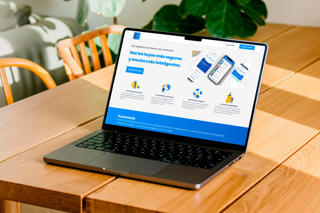
I was the only designer on the project for the first three months. That meant everything fell on me: the product architecture, the brand identity, wireframes, high-fidelity screens, the marketing website, the design system. All of it, simultaneously.
And here is the part I have to be honest about: during those three months, I had zero conversations with the development team. The devs hadn’t been assigned yet. I was designing in a vacuum. I built 48 screens for the web app MVP, a design system from scratch, and the landing page, all without knowing what the team building it would need, what constraints they’d face, or what was technically feasible within our timeline.
This would come back to bite me.
The Process
1. Scope Negotiation
The CEO wanted three things simultaneously: a template engine for lawyers, a contract execution flow for field agents, and a full management dashboard. I pushed for a single, complete flow rather than three partial ones.
This took three separate conversations before we reached a decision. First, the CEO talked to me alone. Then to the dev team alone. Then all of us together. The final agreement was a middle ground: reduce the number of flows, but the selected flow had to work completely. No shortcuts within the core experience.
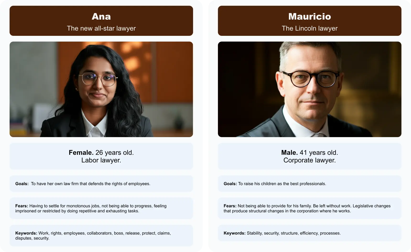
2. Value Proposition and User Modeling
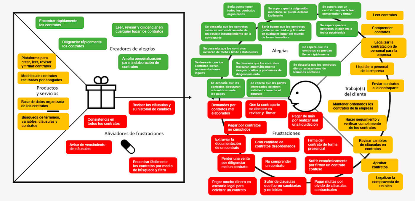
We mapped legal pain points against potential gains using a Value Proposition Canvas. The critical insight was that lawyers didn’t want more features. They wanted fewer decisions. The “Tech-Forward Junior Associate” needed speed and a clean UI. The “Experienced Partner” needed compliance guarantees and the assurance that nothing would break their established workflows.
This tension between speed and stability defined every design decision that followed.
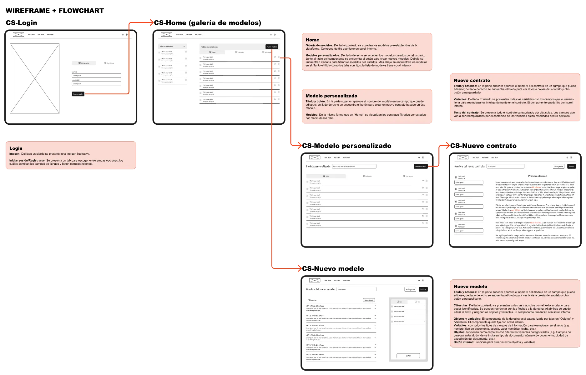
3. Information Architecture
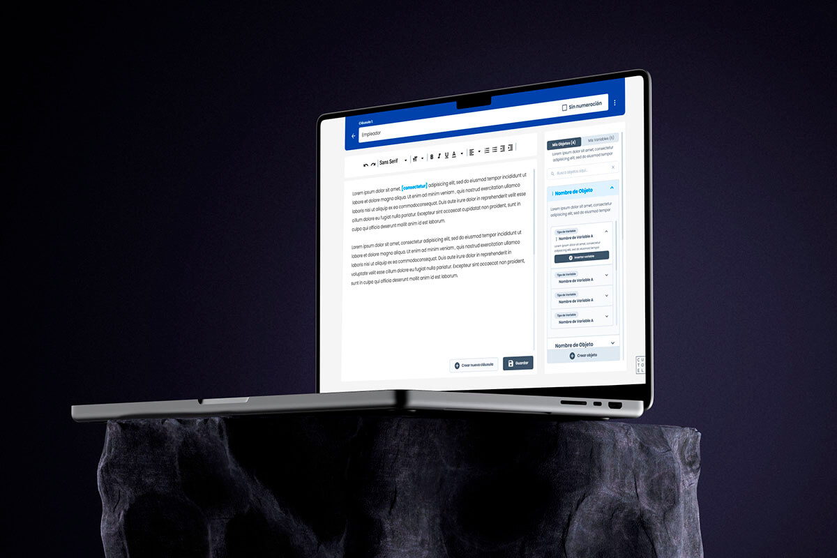
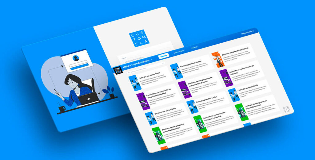
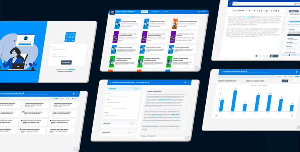
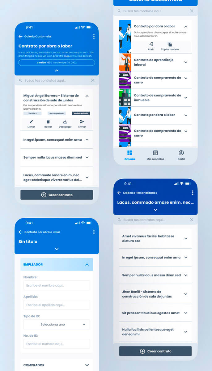
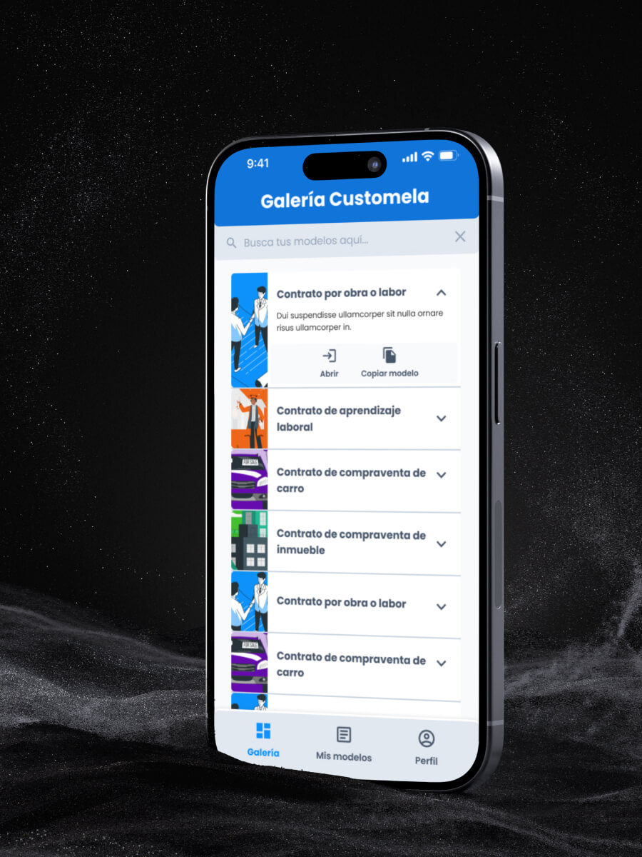
We organized the platform around three core pillars: Templates, Active Contracts, and User Profile, all behind a secure authentication wall. The architecture was designed so that a lawyer could go from “I need a contract” to “signed and archived” without leaving the platform.
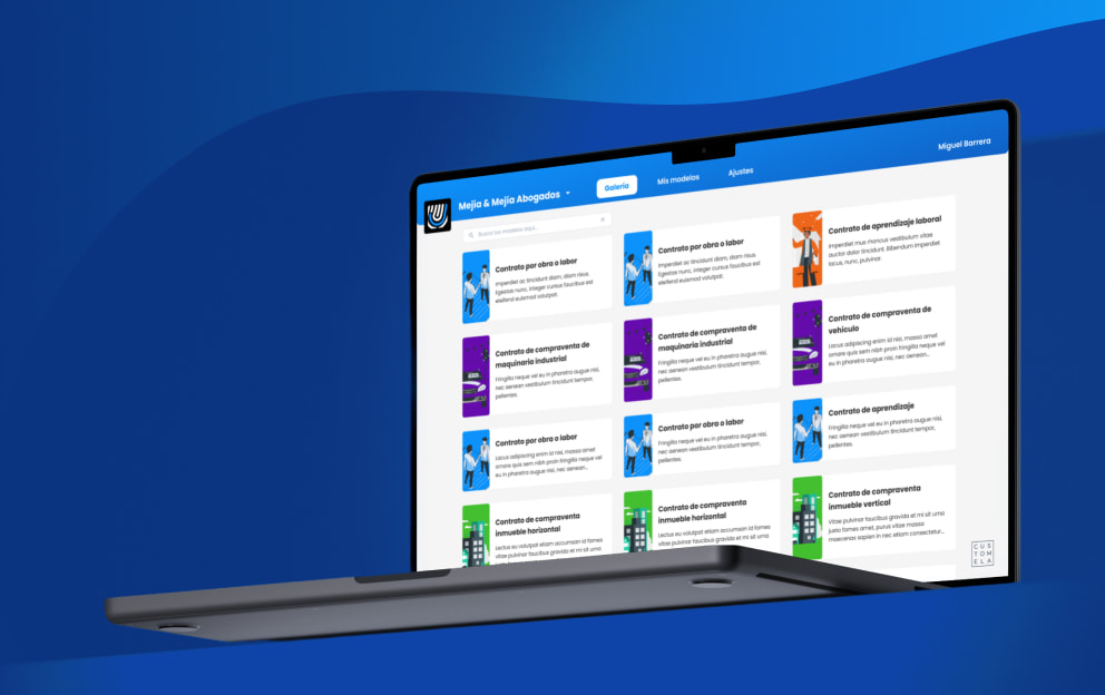
User journey mapping revealed the biggest drop-off point: clause selection. Users were overwhelmed by the number of options. The solution was a “Gallery of Predefined Templates” that narrowed infinite possibilities into structured starting points.

4. Flowcharts and Logic Mapping
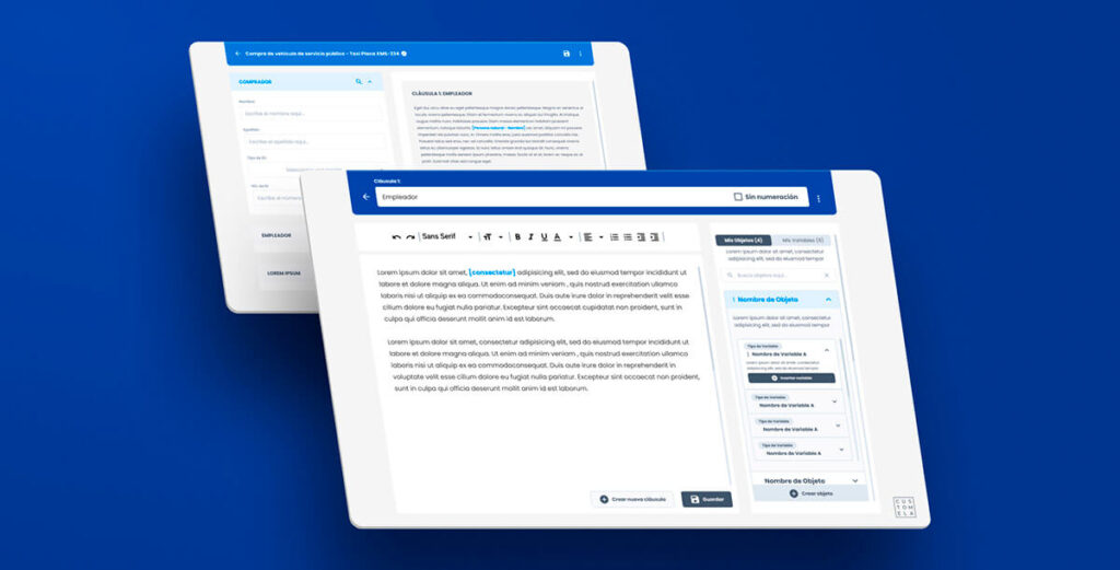
Legal contracts aren’t linear. They branch. A single variable like currency type, social security deductions, or a yes/no clause can cascade into completely different contract structures. I mapped these “If/Then” logic flows before designing any UI to ensure the interface could handle the complexity underneath.
5. Flowcharts & Logic Mapping
We mapped the “New Custom Model” flow to handle complex “If/Then” logic for variables like currency, social security deductions, and yes/no clauses.

6. Wireframing and Testing
Low-fidelity wireframes came first. We conducted Tree Testing with Optimal Workshop to validate that users could find specific clauses without guidance. This led to one of the most important pivots early in the project: the initial design merged templates and custom contracts into a single flow. Users found it confusing. We separated them, and navigation clarity improved immediately.
Card Sorting helped us narrow down the variable types to 7 key categories (Currency, Logic, Dates, among others), which became the backbone of the contract creation engine.
7. Brand Identity:
For the brand, I chose a “Trust Blue” palette to evoke the stability lawyers associate with traditional firms, paired with modern sans-serif typography and a “secure frame” logo that signaled technological progress without abandoning the sense of reliability. The brand had to say: this is new, but it’s safe.

8. High-Fidelity Design & Prototyping
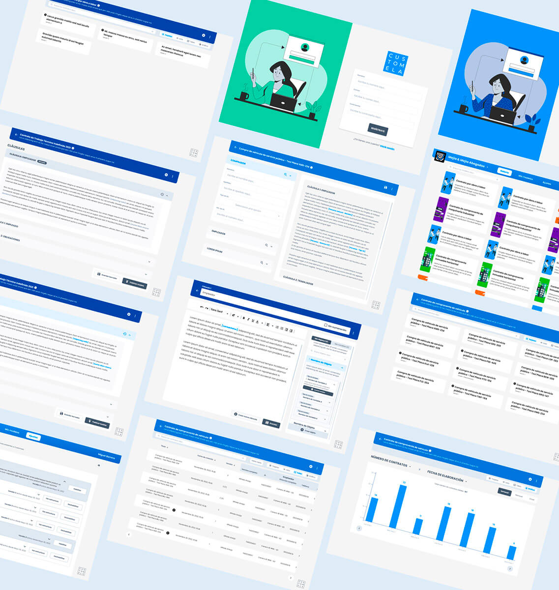
The final design phase produced 48 screens for the web app MVP, a complete design system built from scratch (light mode only for the MVP), and the marketing website. I built interactive Figma prototypes for five distinct flows and used First-Click testing to measure the intuitiveness of the Variable Creation modal, refining it until the experience felt more like filling a simple form than programming logic.


The Design Review That Changed Everything
Three months in, three developers were finally assigned to the project: two back-end developers and one front-end developer who was also a designer. They opened my Figma file. And the conversation that followed was the most important one of the entire project.
Three problems surfaced immediately:
- First: the back-end logic was significantly more complex than what my visual designs suggested. The CEO had pushed for business logic that required deeper technical architecture than what was visible in the UI.
- Second: I hadn’t properly accounted for responsive design. Screens that worked beautifully on desktop broke on smaller viewports. This was a direct consequence of designing without dev input.
- Third: the elaborate animations I had designed were technically expensive. Most were pushed to post-MVP, except for the navigation transitions between subpages that were essential to the user experience.
The dev team and I did a complete audit. We went back to the CEO with two options: build everything as designed (more time, more risk, high uncertainty) or simplify the scope to one complete flow with all its features, then build the rest iteratively. After three separate conversations, the CEO agreed to the second option. No feature reduction within the selected flow, but fewer flows overall.
The Solution
What we shipped was a dual-layer system:
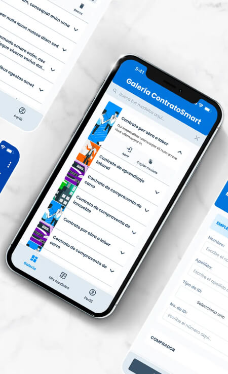
- The Executor Layer (Web app, later iOS): Field agents and clients could complete contracts using intuitive, error-proof forms. Pre-filled variables, automated calculations, and QR-code verification replaced the manual typing and physical signing that had been causing errors and delays.
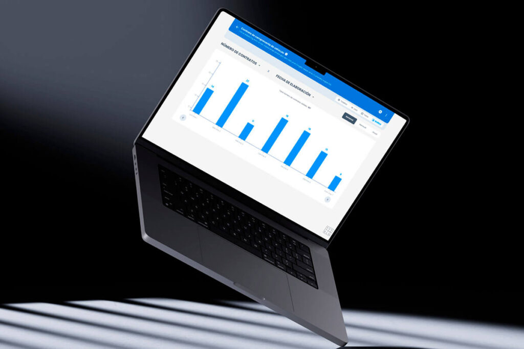
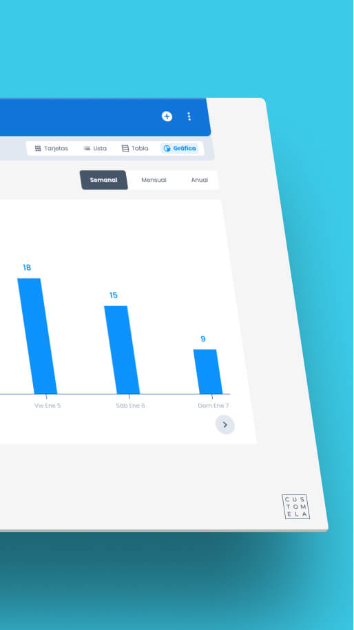
- The Architect Layer (Desktop): Senior lawyers could build “Smart Templates” with custom logic, defining which variables, clauses, and calculations were available for each contract type. This gave them control without requiring technical knowledge.
What Survived Implementation
The web app MVP launched with 65% fidelity to the original Figma. The other 35% changed during the build as new technical constraints surfaced. These weren’t arbitrary cuts. They were decisions made in real time when the team hit limitations that my isolated design phase hadn’t anticipated.
The iOS mobile app was built after the web MVP. Android didn’t make the timeline. Dark mode was added post-launch. The total screen count eventually reached approximately 70 screens including post-MVP additions.
Interactive Prototype (Web App)
Both the web app and mobile app prototypes are available for review, showcasing the contract creation flow, the template management system, and the variable logic engine.
Customela went from internal tool to standalone SaaS. The process went from isolated design to cross-functional collaboration. Both transformations shaped how I build products today.See more of my work at miguelba.com
Interactive Prototype (Mobile)
Results
Despite the gaps between design and build, the product delivered real impact where it mattered most: replacing the manual workflow that was costing legal teams time, accuracy, and sanity.
Accuracy
70% reduction
Typing errors per contract: from 7 to fewer than 2
Speed
5x faster
contract completion (from 20 minutes down to 4)
Verification
3x faster
authenticity checks using QR-code-based methods
Productivity
2x boost
in lawyer output through template-based creation
Satisfaction
95% NPS
achieved during the initial launch stage
Where I Fell Short
I owe this section to anyone reading this case study expecting a clean success story.
I designed 48 screens over three months without a single conversation with the development team. Not because I chose to ignore them. They hadn’t been assigned yet. But I could have pushed for early tech input. I could have asked the CEO to bring in at least one developer for architecture conversations before I started building the design system from scratch.
I didn’t. And when the devs finally opened the Figma, 35% of what I had designed needed to change.
The responsive design gaps, the animation complexity, the back-end logic I couldn’t see from the design side. All of these could have been caught earlier if I had insisted on cross-functional input from the start. The QA of the web app also suffered because I was simultaneously designing the mobile app and supervising another Joonik project. There wasn’t enough time to be thorough in all three. Something always gave.
At one point the workload became unsustainable, and Joonik assigned a second designer to help. That helped. But the damage from the initial isolation was already built into the product.
What This Project Taught Me
Customela sits at the center of my career arc. It’s where I transitioned from “designer who makes screens” to “designer who understands what it takes to ship.”
Horizontal communication is not optional
If Keller Offers taught me about vertical communication (what happens when the trenches can’t reach management), Customela taught me about horizontal communication: what happens when design and development work in parallel without talking to each other. You can build a Figma file of 48 pristine screens, and if dev opens it for the first time three months later, a third of it will need to change.
I wrote about this contrast between the two projects in my post on why the most important skill for a designer isn’t design.
The MUI decision that carried forward
At Keller Offers, the dev team adopted Devias Kit Pro without consulting design, and it created a permanent gap between Figma and the build. That experience directly influenced how we handled the design system at Customela. For the web app, I built the design system from scratch (because there was no dev to consult). But for the mobile app, we adopted MUI as a shared foundation, and I actively consulted with the development team during the design process. The mobile app shipped with significantly tighter alignment.
Scope negotiation is a design skill
The three conversations with the CEO to define the real MVP were harder than any design challenge in this project. The CEO wanted everything. The dev team needed constraints. My job was to find the middle ground where we shipped something complete rather than something sprawling and half-built. That skill, knowing how to scope a product, turned out to be as important as knowing how to design one.
What I changed for the next project
After Customela, I made a personal rule: never design more than one sprint ahead without dev input. At Sell2Rent, where I work today, I sit in both marketing and development meetings from day one. I am the only person in both rooms. The instinct to bridge those conversations didn’t come from a methodology book. It came from opening a Figma file with three developers staring at 48 screens they’d never seen before, and watching a third of the work evaporate.
You can read about how that plays out in practice in how AI changed my daily work as a product designer.
Learnings
User testing in legal is non-negotiable
Our initial assumption was that lawyers wanted maximum flexibility. They didn’t. They wanted structured simplicity. Card Sorting narrowed infinite possibilities into 7 key variable types. Tree Testing validated navigation logic before we built it. First-Click testing refined the Variable Creation modal until it felt like a form, not a coding environment. Every round of testing killed an assumption we would have shipped otherwise.
An MVP is not about how much you build
It’s about how well you solve the core pain. The manual process of typing contracts in Word, emailing PDFs, and signing physically was the burning problem. Everything we built pointed at that one thing. The features that didn’t directly reduce typing errors, speed up completion, or simplify verification got pushed to post-MVP. That discipline is what got the product to market.
65% fidelity is still a launch
Only 65% of the original Figma survived implementation. That sounds like a failure. It wasn’t. The 35% that changed were adaptations to real constraints discovered during the build, not compromises on quality. Shipping a product that solves the problem at 65% fidelity beats a pixel-perfect Figma that never sees a user. I wrote more about this tension in building before product-market fit.