How I turned a project in crisis into 64 high-fidelity screens, a complete design system, and a process that changed how I work forever. The product never shipped as designed. The lessons did.
Context
I was brought in through Joonik, an IT staff augmentation company, after the project had been stalled for 1 to 2 months. The previous designer, closer to a front-end developer than a product designer, had produced basic visual designs without stakeholder alignment, information architecture, or UX flows. Keller Williams was frustrated. Not with the visuals. With the experience.
The Real Problem
When I opened the Figma file for the first time, the problem was obvious. Not in the screens. In what was missing between them.
No one had talked to stakeholders about the actual workflow. The designs were a collection of UI components with no story connecting them. Real estate agents using the Cash Offers program had a specific daily rhythm: check urgent bids, respond to leads fast, track active deals, stay compliant. None of that rhythm existed in the product.
The scope was also dangerously bloated: Cash Offers + Concierge + Market Center, three different user types, three different processes, and a mountain of real estate legal terminology that nobody had translated into product language.

My Role and Entry Point
My first decision was counterintuitive: stop designing.
I proposed a full week without touching Figma. Instead, I set up conversations with everyone involved: the PM at Keller Williams, their dev team, the PM at Joonik, and the previous designer. This was my initiative, not management’s. Nobody asked me to pause. I did it because I had seen what happens when you design without understanding the real problem.
After that week, I had a clear picture: we needed to cut the scope down to one product (Cash Offers only), one user type (Keller Williams real estate agents), and build the client-facing website alongside the internal web app.
The Process
1. Audit and Scope Definition
The original scope included three programs and three user types. I pushed to focus on Cash Offers exclusively. One product. One user. One complete flow. This meant difficult conversations with stakeholders who wanted everything at once, but it was the only way to deliver something real in the timeline we had.
2. User Modeling
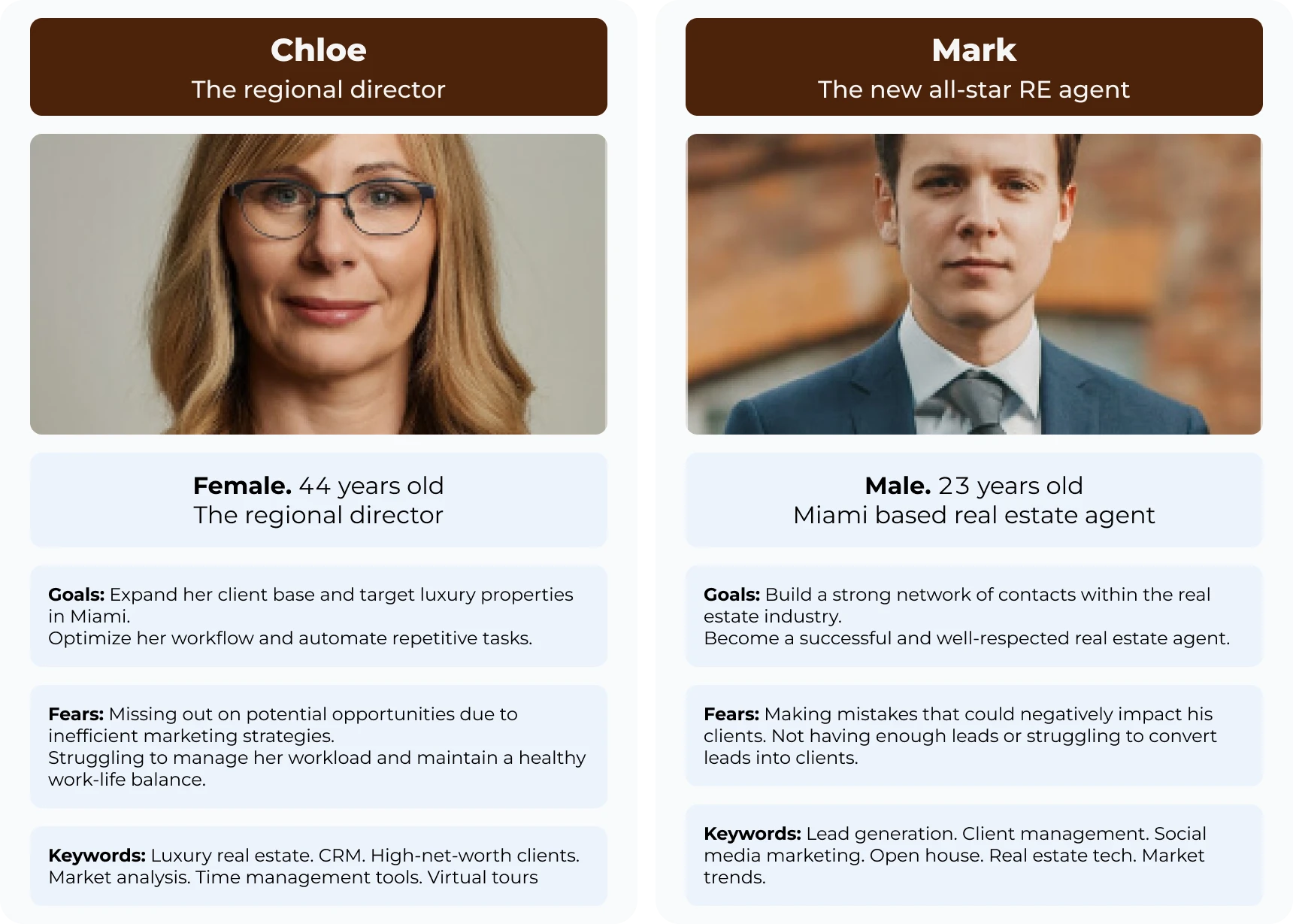
We identified two core personas that mattered for Cash Offers. The high-volume agent who needed a bird’s-eye view of multiple deals and instant notifications to stay ahead of competition. And the transitioning homeowner who required clarity, trust, and a low-friction way to request a cash offer without drowning in paperwork.
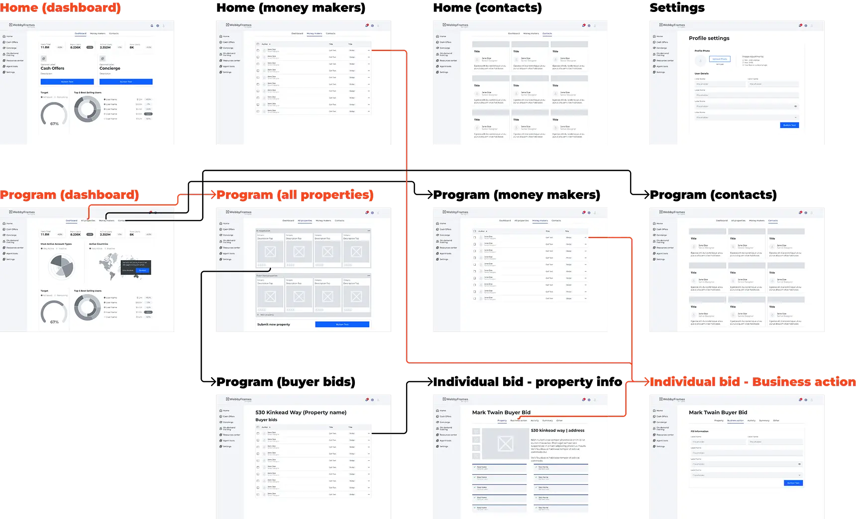
3. Information Architecture & Sitemaps
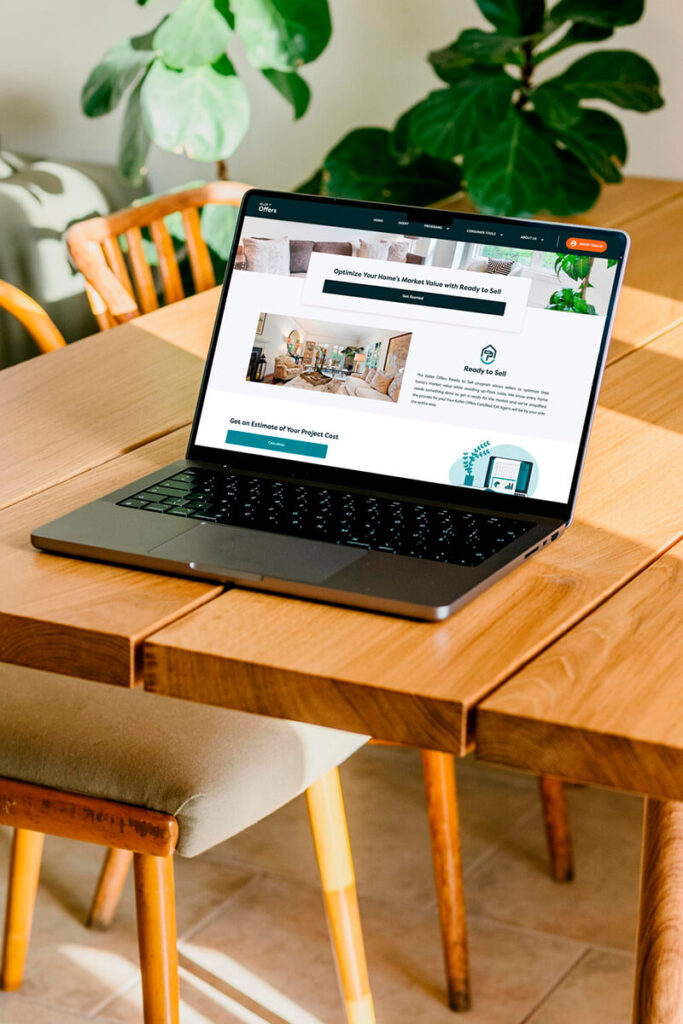
I mapped the full ecosystem in Miro so that every transition between public lead generation and private transaction management was intentional and traceable. The lead gen website was designed as a high-conversion funnel for Cash Offers. The web app was the deep-work environment where a simple lead became an active transaction with clear hierarchical navigation.
This phase also involved documenting previously unwritten real estate terminologies and legal compliance steps. Nobody had done this work before. Without it, the product would have been technically impressive but functionally useless for agents who live inside a web of regulations.

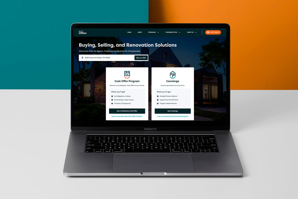
- Lead Gen Website: Focused on a high-conversion funnel for “Cash Offers” and “Concierge” programs.
- The Web App: Designed as a deep-work environment, transitioning the user from a simple “Lead” to an active “Transaction” with clear hierarchical navigation.
4. Wireframing the “Money Makers”
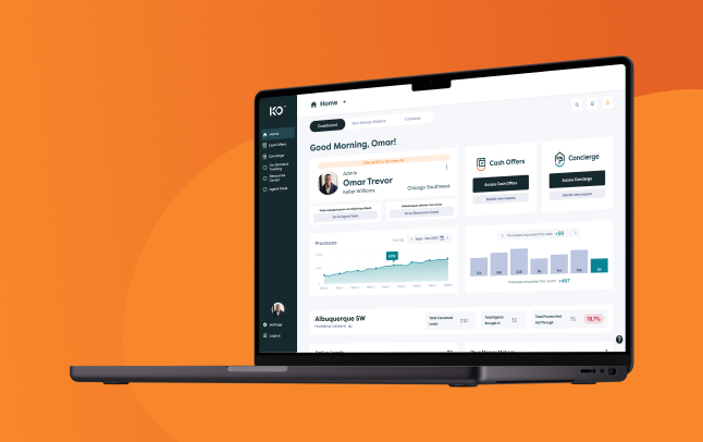
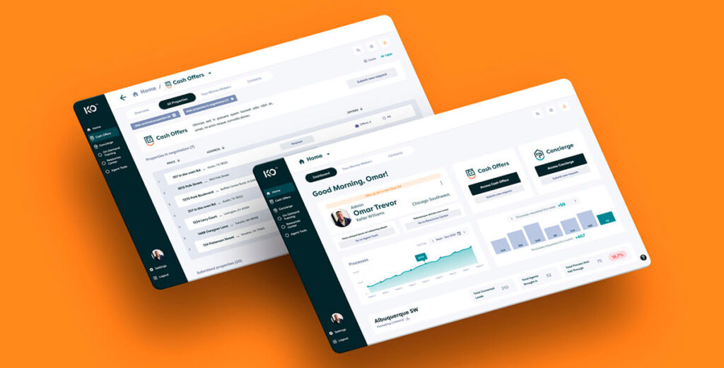
The dashboard was the core of the product. I started with low-fidelity wireframes, iterating rapidly to find the right balance between three layers: the urgency layer (time-sensitive alerts and bids), the active deal layer (properties in progress), and the support layer (marketing resources and compliance checklists).
This wasn’t just a task list. It was designed to match the actual daily workflow of a Keller Williams agent: what do I need to do today, in three days, this week. Clarity of the next step, always.
5. High-Fidelity Design & Prototyping
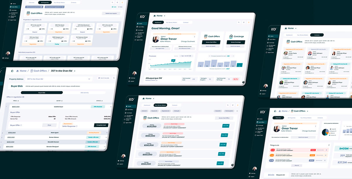
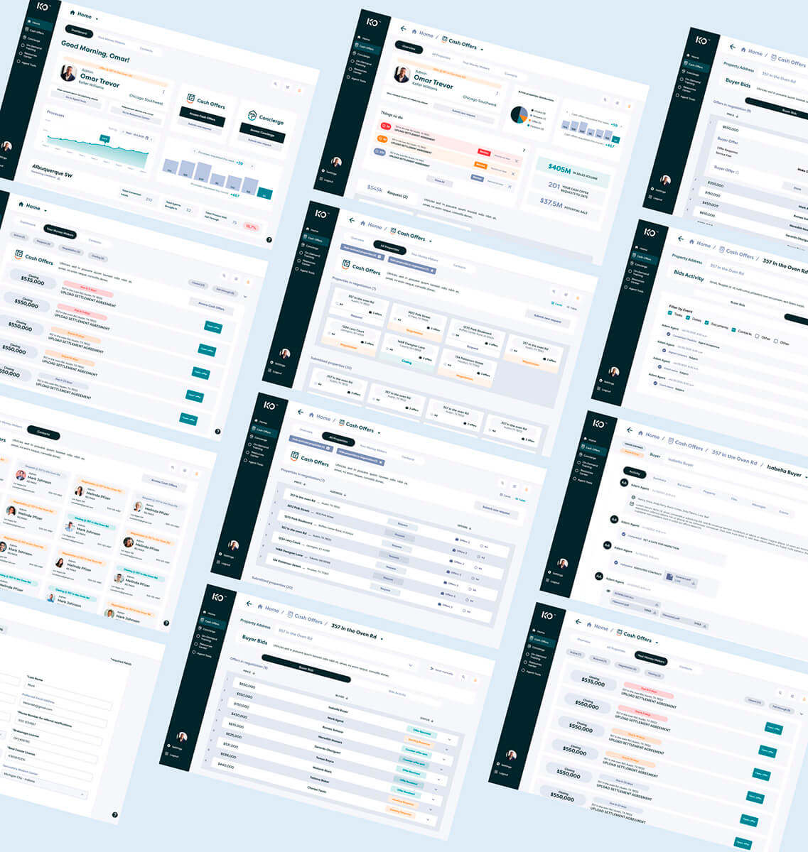
The final phase produced approximately 64 screens across the web app and responsive website. The design system was built on MUI (Material UI) for consistency and scalable component building.
Two screens became the strongest pieces of the project:
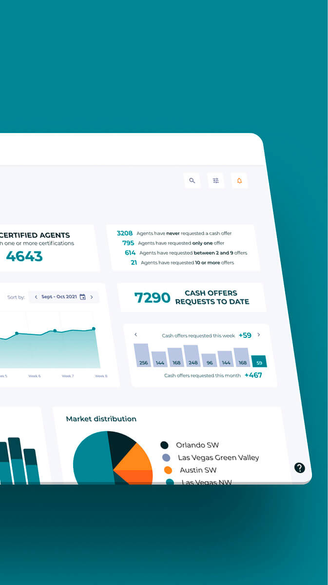
- Market Center Dashboard: Agent behavior metrics by sector across the U.S. with competitive ranking between regional groups. The first screen agents would see when logging in. It turned complex data into an actionable dashboard with built-in competitive dynamics between regions.
- “Your Money Makers”: The prioritized task screen. What you need to do today, in three days, this week. Designed specifically for the Cash Offers workflow, it replaced the chaos of manual tracking with clear, time-ordered actions.

6. UX Research with Prototypes
We tested the high-fidelity prototypes using Optimal Workshop with a mixed sample: internal Joonik team members, real estate agents from Colombia (part of Joonik’s owner’s operation), and approximately 25 Keller Williams agents in the U.S.
The prototype testing indicated faster property analysis workflows and reduced response times compared to the existing manual processes. But I want to be clear: these were prototype metrics, not production metrics. The product as I designed it in Figma never reached users in its final form. What the research validated was the logic and flow of the design, not the performance of a live product.
The Solution
The final scope included a high-conversion responsive marketing website and a complex internal web app for the Cash Offers program.
- The “Money Makers” Dashboard: A centralized task management hub surfacing time-sensitive Business Actions. Agents could respond to bids and leads instantly without switching between email, phone, and spreadsheets.
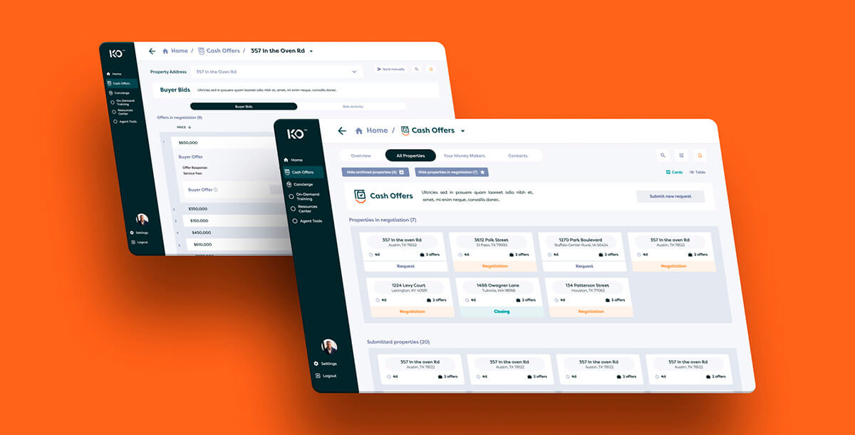
- Bidding and Transaction UI: Deep-level views for property activity, internal messaging, and bid management. Designed to replace the slow, manual communication that was costing agents deals.
- On-Demand Resources: An integrated Resource Center with training checklists to ensure agents stayed compliant and equipped with the latest marketing collateral.
The entire visual language respected Keller Williams’ brand identity while building a custom component library that handled the complexity of real estate transactions without cognitive overload.
Interactive Prototype (Website)
Interactive Prototype (Web App)
The web app prototype is available for review, showcasing the full Cash Offers flow, the Money Makers dashboard, and the bidding and transaction interfaces.
This project is part of my journey from product designer to product builder. Read more about how I work today at miguelba.com
Where It Failed
Here is the honest part. Keller Offers never shipped as designed. Joonik was removed from the project by Keller Williams, and their internal team continued development on their own.
The failure wasn’t in the design. It was structural.
The Devias Kit Problem
We had agreed to use MUI as the design system foundation. The development team, without consulting design, adopted Devias Kit Pro, a MUI template optimized for data dashboards. It worked for basic components like buttons, states, and switches. But the custom real estate flows that made Keller Offers unique? Those didn’t exist in any template. They had to be built from scratch anyway.
The result was a permanent gap between Figma and the actual build. A gap that was never resolved.
The Vertical Communication Breakdown
This is the deeper lesson. Joonik’s management participated in exactly two meetings: one long session at the beginning and one follow-up. After that, they disappeared from the day-to-day. They kept making decisions and adding requirements without understanding the real scope or the trade-offs being made in the trenches.
Design and dev were aligned at the ground level. But the conversations never traveled up. When Keller Williams saw the high-fidelity Figma prototype next to the functional product, the gap was undeniable. They treated the Figma as what was promised and the build as what was delivered.
No one had managed expectations about the difference between a prototype and a production product. That was management’s job. It didn’t happen.
What This Project Changed
Failed projects are expensive. But the expensive ones teach you things that success never could.
After Keller Offers, Joonik implemented a completely different process: daily conversations with the development team, weekly audits at the end of each sprint, and start-of-week sessions to define what gets built and how errors get corrected. The goal was simple: no surprises at the end. Mistakes identified early, decisions made immediately.
That process was applied directly to my next project, Customela’s mobile app. Where the web version had suffered from designing in isolation (I built 48 screens without talking to dev, and only 65% survived implementation), the mobile app was different. I consulted with the development team during the design process. We adopted MUI as a shared design system. The result was tighter alignment and fewer surprises at handoff.
You can read the full story in my Customela case study. The contrast between the two projects tells you everything about what changes when design and dev actually talk before opening Figma.And today at Sell2Rent, the lesson is fully embedded. I sit in both marketing and development meetings from day one. I am the bridge between those two worlds. The communication isn’t just horizontal (designer to dev) or vertical (team to management). It’s omnidirectional. That instinct to be in every room where decisions are made? It started here, at Keller Offers, watching what happens when those rooms stay disconnected.
Learnings
Two types of communication, both essential
Keller Offers taught me about vertical communication: what happens when the people in the trenches (design + dev) can’t get their reality to the people making decisions (management). My work at Customela later taught me about horizontal communication: what happens when design and dev work in parallel without talking to each other. You need both. Miss either one, and the project pays for it.
A beautiful Figma file is not a product
64 screens of high-quality design in Figma mean nothing if the team building the product can’t replicate them. Prototype testing can validate your logic, but it can’t guarantee the build. Managing the gap between what’s designed and what ships is not a designer’s side task. It’s a core responsibility.
Design systems need specificity
Agreeing on MUI as a foundation was the right call. But the specific template that dev chooses matters as much as the framework itself. After Keller Offers, I learned to specify exactly which components, which variants, and to document the agreement before anyone opens VS Code.
Stop before you start
My first week on the project, I did zero design work. I paused, talked to every stakeholder, audited everything that existed, and mapped the real scope. That week of not designing was probably the most productive week of the project. It’s a practice I’ve carried into every project since, and it’s part of why I believe the most important skill for a product designer isn’t design.