Strategy: From Friction to Flow
I stepped in to lead the design mid-cycle after the project stalled due to undefined problem statements and misaligned stakeholder expectations.
- Audit and Realignment: I halted production to transition from “designing for features” to “designing for solutions,” ensuring the project addressed the actual bottlenecks in the agent workflow.
- User Modeling: Developed personas to bridge the gap between novice agents needing leads and veterans seeking workflow automation.
- Process Architecture: Mapped the journey from consumer landing pages to platform deal-closure using Miro, documenting previously unwritten real estate terminologies and legal compliance steps.
- Systemic Scalability: Transitioned the development foundation to a MUIX Design System using Atomic Design, allowing for rapid, consistent component building.

The Design Process: From Fragmented to Functional
To move from a fragmented ecosystem to a high-velocity command center, I followed a structured, user-centric design methodology. This ensured every pixel served the dual goal of agent productivity and homeowner conversion.
1. Defining the User (Personas)
Before pushing pixels, we identified the core pain points of our primary users. We developed detailed personas for:
- The High-Volume Agent: Needs a “bird’s-eye view” of multiple deals and instant notifications to beat competition.
- The Transitioning Homeowner: Requires clarity, trust, and a low-friction way to request a cash offer without feeling overwhelmed by paperwork.

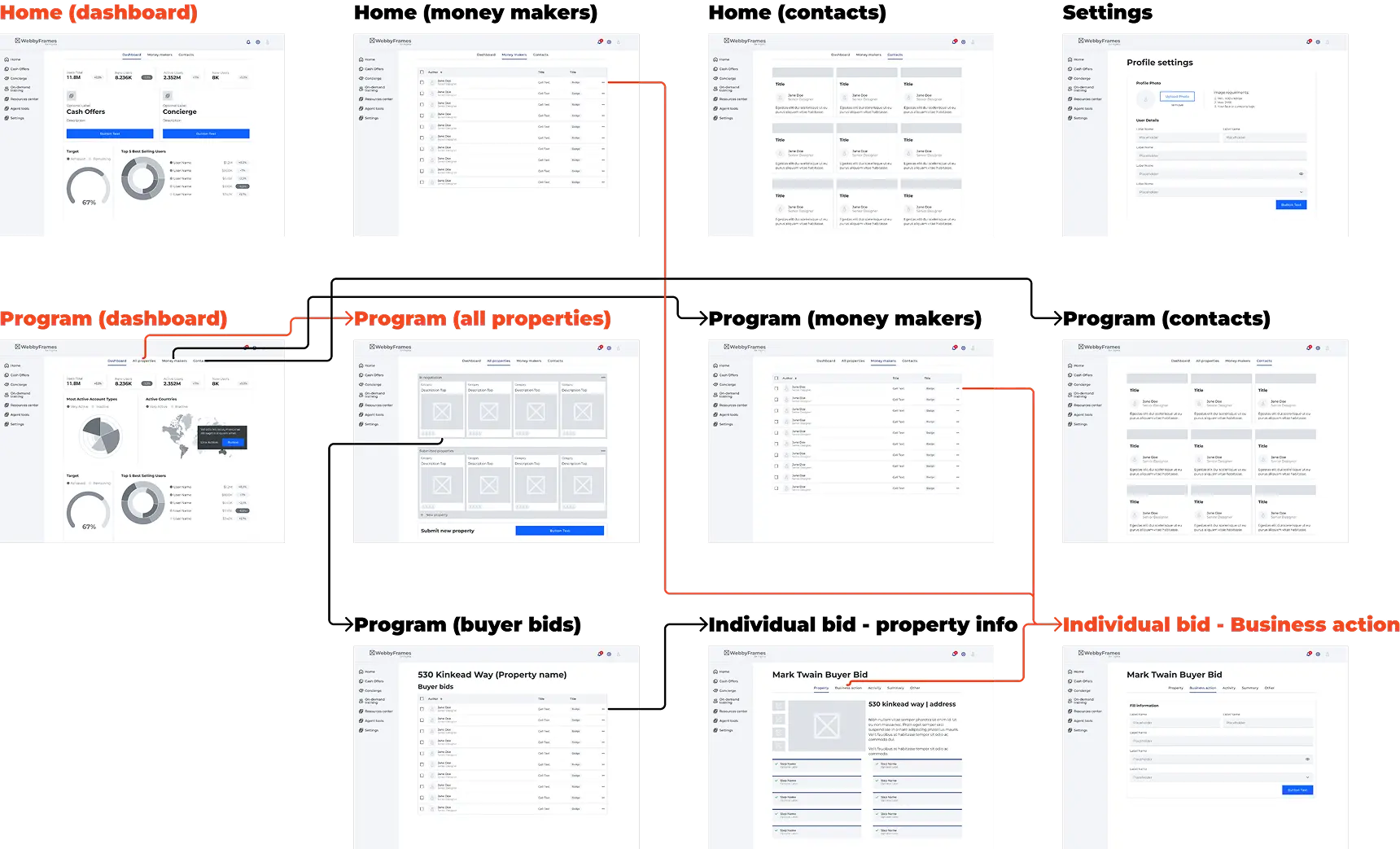
2. Information Architecture & Sitemaps
We mapped out the ecosystem to ensure a seamless handoff between public lead generation and private transaction management.
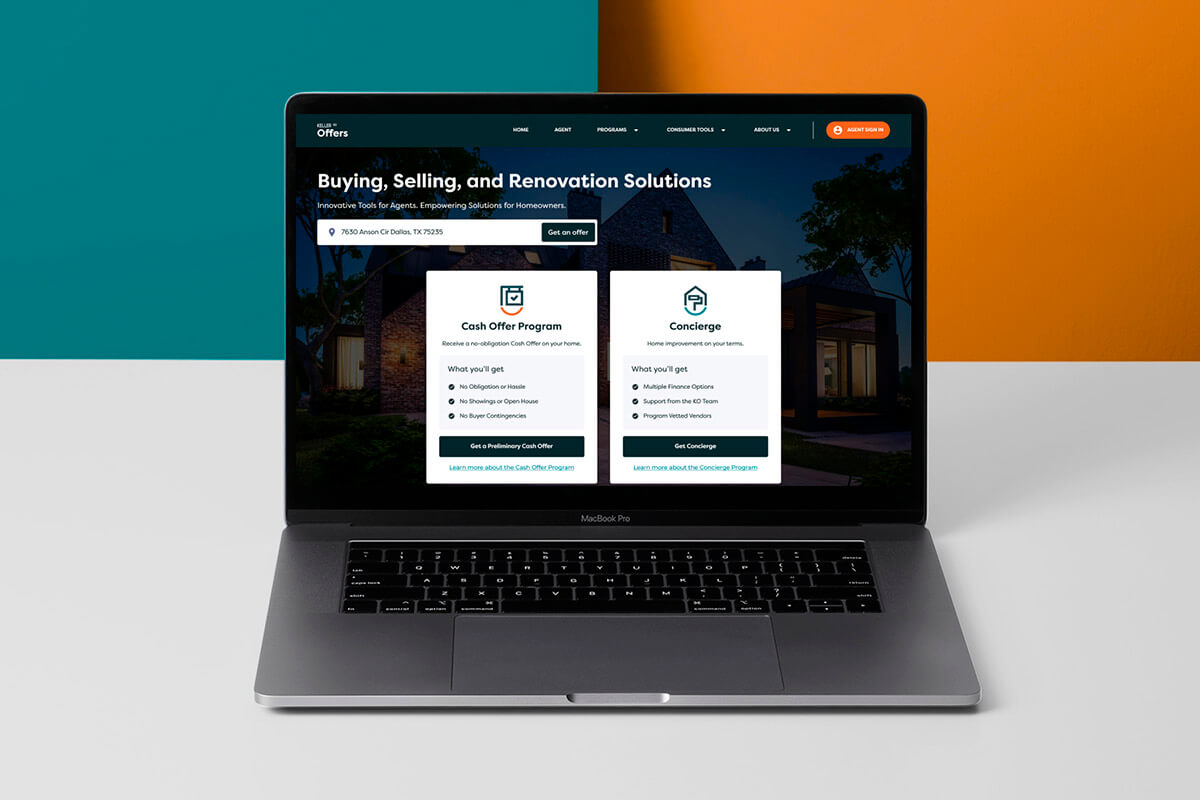
- Lead Gen Website: Focused on a high-conversion funnel for “Cash Offers” and “Concierge” programs.
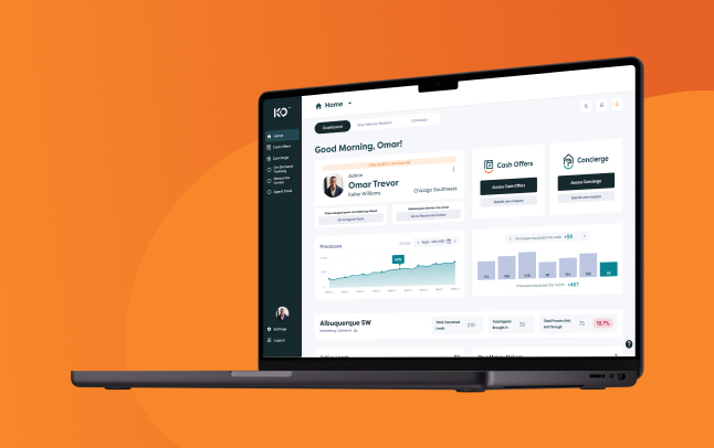
- The Web App: Designed as a deep-work environment, transitioning the user from a simple “Lead” to an active “Transaction” with clear hierarchical navigation.

3. Wireframing the “Money Makers”
I started with low-fidelity wireframes to iterate rapidly on the “Money Makers” dashboard. The goal was to solve the “manual task tracking” problem. We tested various layouts to find the optimal balance between:
- Time-sensitive alerts (The “Urgency” layer).
- Active property bids (The “Active Deal” layer).
- Marketing resources (The “Support” layer).
4. High-Fidelity Design & Prototyping
The final phase involved a comprehensive UI overhaul in Figma, split into two distinct but unified experiences:
- The Responsive Website: A modern, trust-focused interface optimized for mobile lead capture.
- The Web App: A data-rich, high-density interface. We used a “modular card” system so agents could process property data 55% faster, ensuring the complexity of real estate didn’t lead to cognitive overload.


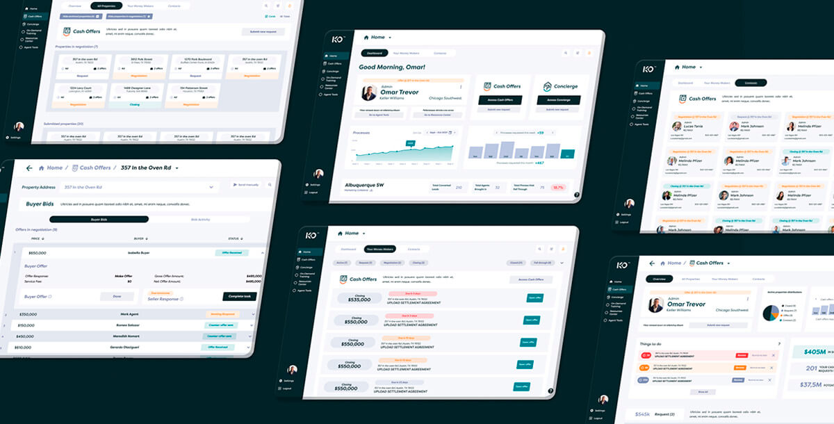
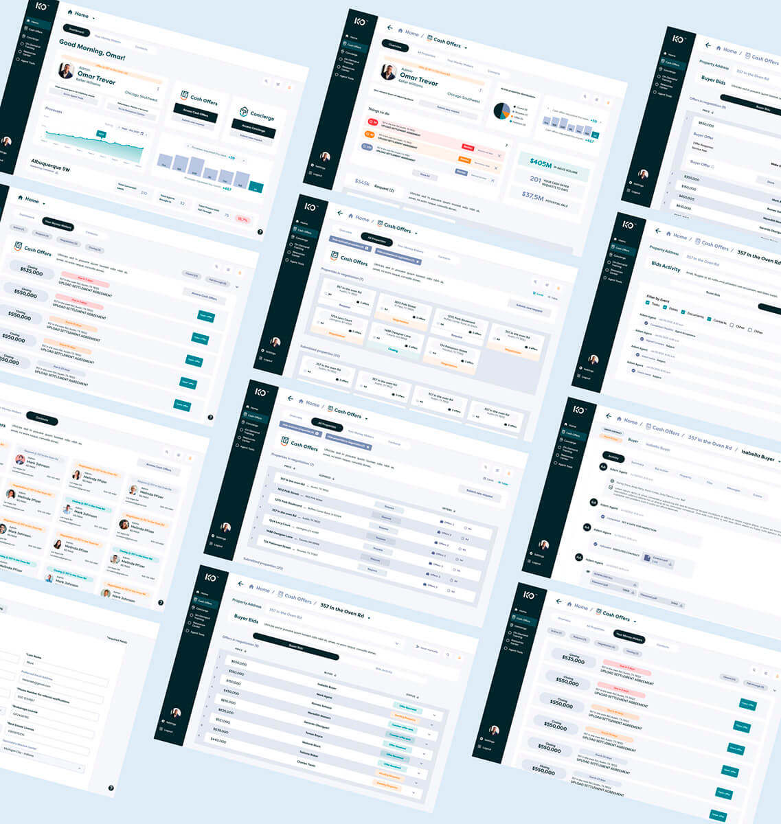
Execution: The Productivity Command Center
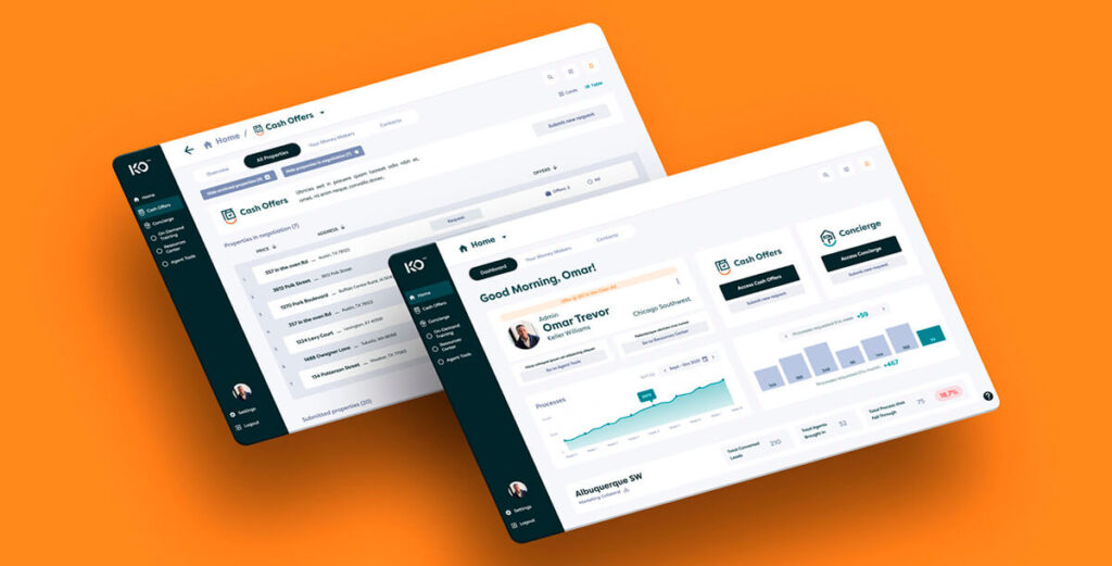
The final scope encompassed a high-conversion marketing website and a complex internal web app featuring the Cash Offers and Concierge programs.
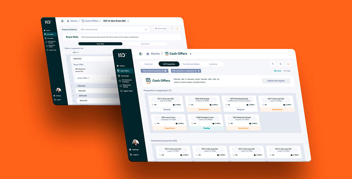
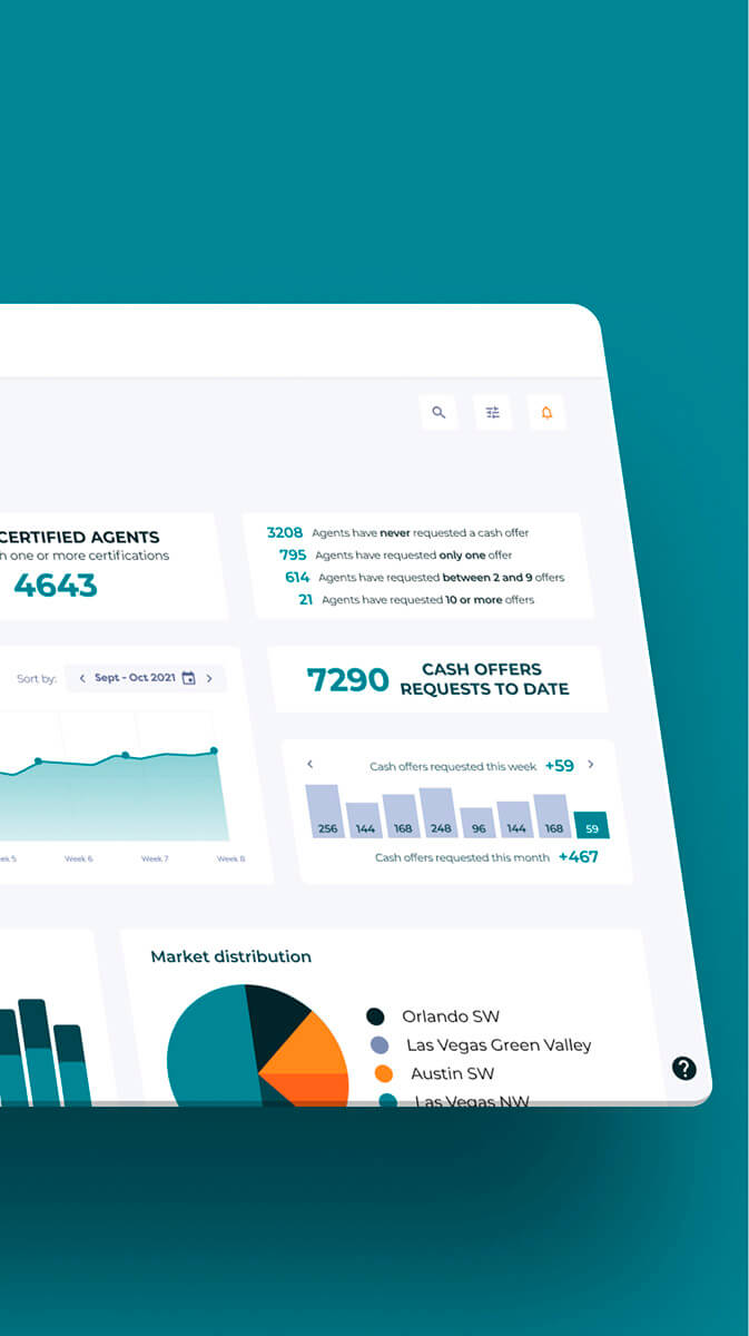
- The “Money Makers” Dashboard: A centralized task management hub that surfaces time-sensitive “Business Actions,” allowing agents to respond to bids and leads instantly.
- Bidding & Transaction UI: Designed deep-level views for property activity, internal messaging, and bid management to replace slow, manual communication via phone and email.
- On-Demand Resources: Integrated a Resource Center and training checklist to ensure agents remained compliant and equipped with the latest marketing collateral.
Results: Performance by Design
The launch of the MVP replaced a fragmented, manual process with a streamlined digital environment, delivering significant efficiency gains.
Productivity
55% increase
in property analysis speed.
Response Time
40% reduction
in lead response time.
User Satisfaction
90% Net Promoter Score (NPS)
at launch.
Growth
20% increase
in Cash Offers program applications.
Learnings & Insights
Data Over Intuition: Taking the time to validate stakeholder “hunches” with user data prevents scope creep and ensures the MVP solves the right problems.
Systemic Consistency: Leveraging a robust library like MUIX is vital for maintaining UI integrity across high-density data screens.
Team Accountability: Establishing a RACI matrix and understanding the team’s “burnup” rate improved delivery estimates and communication across the American and Joonik teams.