I rescued a stalled platform. It still never shipped
Keller Offers, an iBuyer platform for Keller Williams agents: 64 screens, a good design, and a lesson about who has to be in the room.
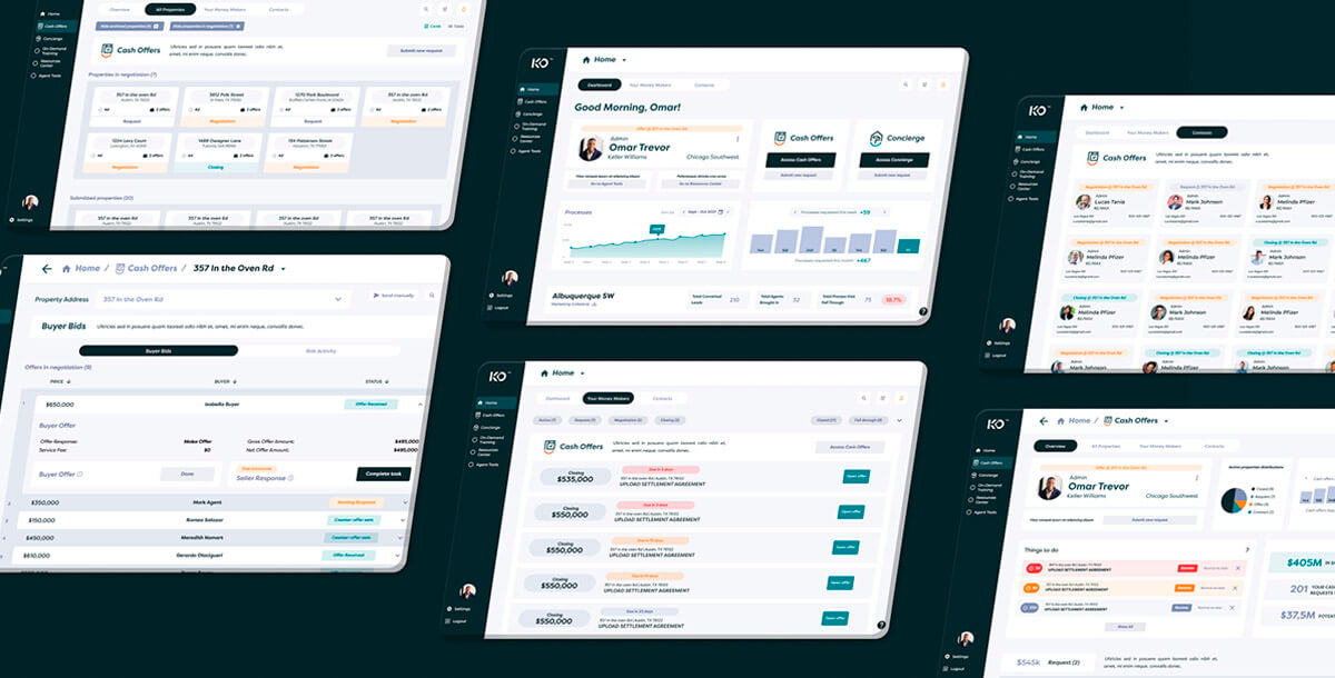
- I joined a project stalled for one to two months and cut a three-program scope down to one product and one user.
- The design was good. The build used a different component kit than we agreed, and management left after two meetings.
- Keller Williams compared the Figma with the build, removed Joonik, and finished with its own team.
Context
Keller Offers was an iBuyer platform for Keller Williams, the largest real estate franchise in the U.S. Think Opendoor, but built for agents instead of replacing them: agents manage cash offers for homeowners who want a fast sale.
I came in through Joonik, the staff augmentation company where I worked. The project had been stalled for one to two months, and the client was frustrated. Not with the visuals. With the experience.
What was missing
The first designer was closer to a front-end developer. He had made basic screens with no stakeholder alignment, no information architecture and no flows.
The scope was also bloated: cash offers, a concierge program and a market center, three kinds of users, and a pile of real estate legal terms nobody had translated into product language.
The problem was not in the screens. It was between them.
The week I did not design
My first move was to stop. I proposed a full week without opening Figma and talked to everyone: the Keller Williams PM, their developers, the Joonik PM and the previous designer. That idea was mine, not management’s.
After that week we cut the scope to one product, cash offers, and one user, Keller Williams agents. We also added the client-facing website to the plan.
What I designed
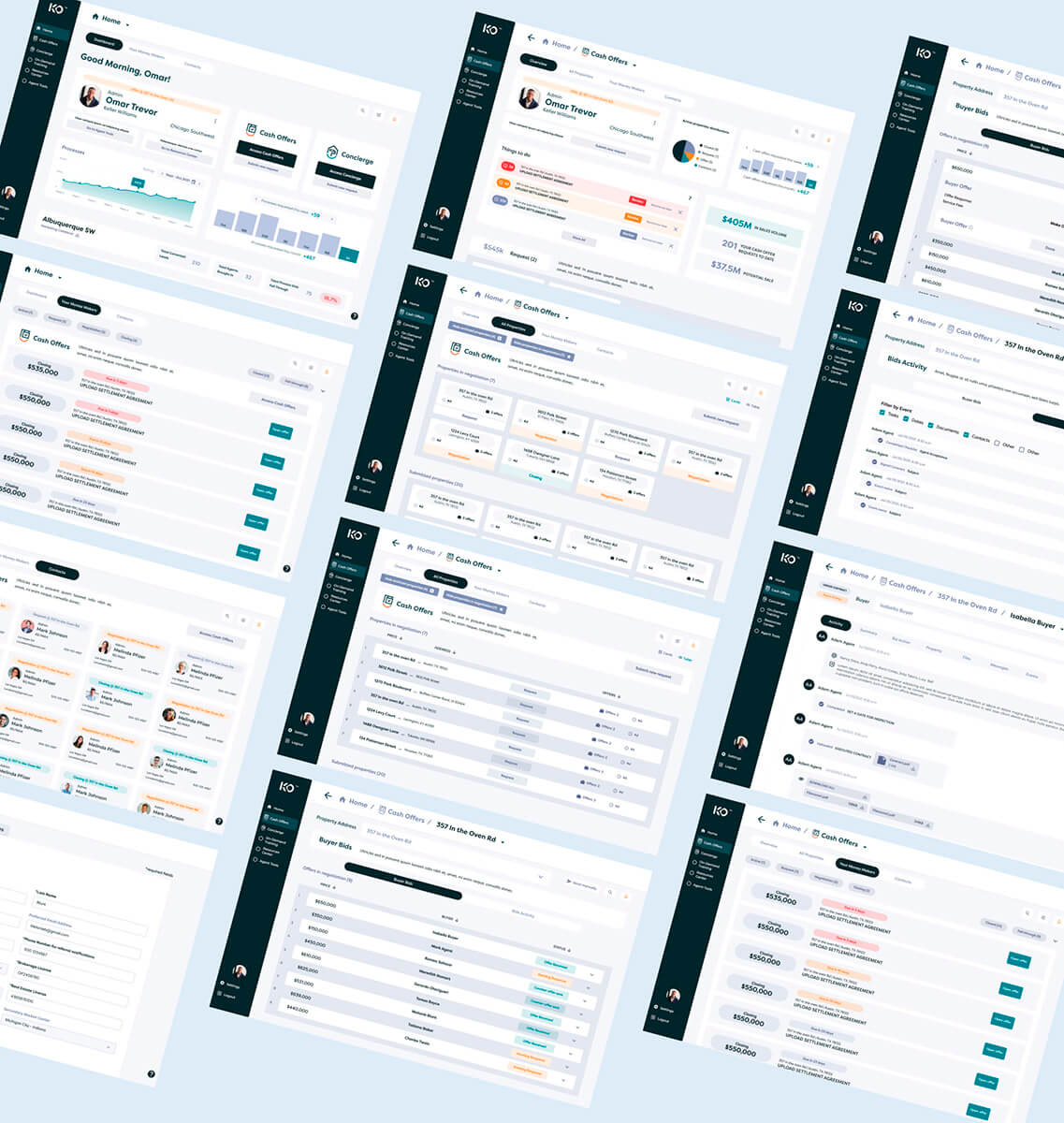
About 64 screens, built on MUI: roughly 58 in the web app and the rest in a responsive site for agent sign-up. Two of them were the strongest work.
Market Center Dashboard. Agent behavior by sector across the U.S., with a ranking between regions. It was the first screen after login and it turned dense data into something to act on.
“Your Money Makers.” A prioritized task screen: what to do today, in three days, this week. It matched an agent’s real daily rhythm.


Where it failed
A kit nobody agreed to. We agreed on MUI. The developers adopted Devias Kit Pro, a MUI template made for data dashboards, without asking design. Buttons and switches worked. The custom real estate flows did not exist in any template and were built from scratch, so the gap between Figma and the build never closed.
Management left. Joonik’s management joined two meetings, a long one at the start and a follow-up, then kept adding requirements without seeing the trade-offs we made day to day.
A prototype read as a promise. Nobody managed the expectation that a high-fidelity Figma is not a product. When Keller Williams saw both side by side, they saw what was promised and what was delivered. They removed Joonik.
Design and development were aligned on the ground. The conversation never traveled up.
What the tests did not prove
I tested the prototypes in Optimal Workshop with Joonik teammates, agents in Colombia and about 25 Keller Williams agents. The results pointed in a good direction. But those were prototype tests, not the product in use, so I do not count them as results. The product never reached users the way I designed it.
What changed after
Joonik changed its process: daily talks with developers, a weekly audit at the end of each sprint, and a start-of-week session to decide what gets built. The goal was no surprises at the end.
I used that on the Customela mobile app, and it is how I work now: in the marketing and development rooms from day one, and with the specific kit and components written down before anyone opens VS Code.

Founding Product Designer in Barranquilla. I design and build with early-stage founders. More about me →